# Jesse M. Ellis - Development notebook for my personal website.
Note: _Revision 1 will be developed from 11/24/2024 to 12/11/2024._
---
### Table of Contents
- [11/24/2024 - First things first](#11/24/2024---First-things-first)
---
## 11/24/2024 - First things first
The point of this website is to build a personal website that highlight's personal projects using concepts we've learned in Caterina Paun's Intro to WebDev at PSU. I am going to attempt to create something that is more oriented toward my personal game development endeavours by theme-ing the website with elements from LunaLight. I will highlight some of the milestones in that project as well as other projects I have done.
**Some technical constraints**
To check the boxes around concepts learned in WebDev this site should be built using the following:
- HTML
- CSS
- JavaScript
- GitHub pages for deployment
### High Level Implementation Plan
**Concept**: _This will be a single-page scrolling website with a fixed navigation bar that alows the user to jump to sections._
1. Sketch a layout design for the following required sections:
- Navbar: Fixed at the top.
- About: Brief introduction and a professional photo.
- Previous Work: Resume highlights or course/skills section.
- Projects: Showcase 2-3 projects with links to GitHub/deployed sites.
- Contact: Form for user inquiries.
2. Build basic HTML structure to represent each section.
3. Style the website with CSS.
4. Implement website interactivity with Javascript.
- Scrolling
- Form validation
- Email contact
- Embedded YouTube Video
5. Test, Refine and Repeat (steps 3-5)
6. Deployment with GitHub pages _(we'll worry about this when we get there)_
### A starting point
Just to get things going I'm going to bring some initial files that create a form with user input functionality.
`form.html`, `form.js` and `styles.css`
These files create a simple form that gets user input and prints it to the console. We will build the entire website from here ;)
---
## 11/25/2024 - Design
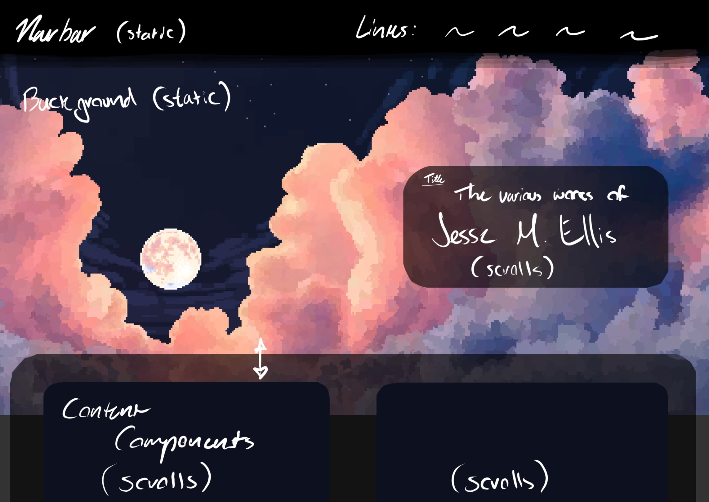
Here's a quick design sketch that captures te aesthetic of the site and some styling. I want the site to mainy highlight my current retro-style game ev project so I think using some pixel art fro mthat as the background is a cool idea.
_Note_: I did this in procreate, which is not great for this sort of thing.
## 11/27/2024 - Figma Design
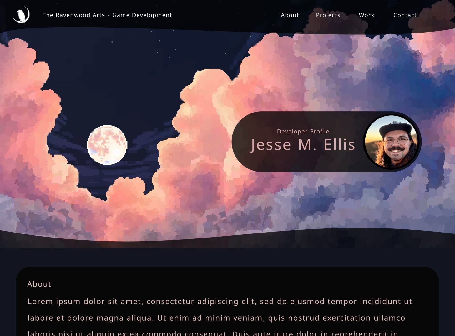
I decided to go ahead and design the website using Figma so that everything I need is ready to go when I start actual implementation.
## 11/30/2024 - Navbar and background
To get started on the above design I think we should get a simple navbar working that can scroll to the various sections.
We should use classes to make things easier later.
```
```
This is a pretty bland webpage with just the html, so let's add the backgound image and some styling.
```
body {
margin: 0;
font-family: Arial, sans-serif;
background-image: url("../images/Clouds.png");
background-size: cover;
background-position: left;
background-attachment: fixed;
}
.navbar {
position: fixed;
top: 0;
width: 100%;
background: rgba(0, 0, 0, 0.7);
color: #fff;
padding: 1rem;
text-align: center;
}
.nav-link {
color: #fff;
margin-right: 1rem;
text-decoration: none;
}
section {
padding: 2rem;
color: #fff;
margin-top: 2rem;
}
```
Much nicer!!! Now let's add in some simple JavaScript to scroll to the different sections by clicking the navbar links.
```
document.querySelectorAll('.nav-link').forEach(anchor => {
anchor.addEventListener('click', function (e) {
e.preventDefault();
document.querySelector(this.getAttribute('href')).scrollIntoView({
behavior: 'smooth'
});
});
});
```
Lookin pretty good!

## 12/01/2024 - Profile Pic
As in the Figma design I want the profile pic and name to be in a rounded box (pill shape) over the background such that it sends focus to the pixel art in the background and then name and pic of the person who created it. Which is me in this case ;). The html portion is not terribly complicated:
```
Developer Profile
Jesse M. Ellis

```
The CSS is a little more tricky as I need the position to be off center to highlight the background but also responsive when changing screen size or scrolling the view. Here is what I came up with:
```
.title-section {
height: 70vh;
display: flex;
justify-content: right;
margin-top: 3rem;
margin-right: 10rem;
align-items: center;
}
.title-box {
display: flex;
align-items: center;
justify-content: space-between;
background: rgba(0, 0, 0, 0.8);
border-radius: 100px;
padding: 1.5rem;
box-shadow: 0 4px 10px rgba(0, 0, 0, 0.2);
max-width: 80%;
min-width: 400px;
}
.profile-pic {
width: 150px;
height: 150px;
border-radius: 50%;
margin-left: 1.5rem;
object-fit: cover;
}
.title-text {
text-align: center;
padding-left: 1rem;
}
.title-text h1 {
margin: 0;
font-size: 1.8rem;
color: #f0caca;
}
.title-text p {
margin: 0;
color: #a07d7d;
font-size: 1rem;
}
```
While were at it we can use a similar approach and set up our other sections. We'll want to add a class for a box in each section like this,
```
```
Then we can add some initial CSS styling,
```
.about-section,
.work-section,
.projects-section,
.contact-section {
display: flex;
justify-content: center;
width: 100%;
}
.about-box,
.work-box,
.project-box,
.contact-box {
background: rgba(0, 0, 0, 0.8);
border-radius: 20px;
padding: 1rem;
box-shadow: 0 4px 10px rgba(0, 0, 0, 0.2);
width: 95%;
color: #fff;
box-sizing: border-box;
text-align: left;
}
```